

These are the items I picked out from around my kitchen. I tried to pick out a mix of simple neutral props and more colourful eye-catching props. I took a birds-eye view picture of my props to show how some may look when placed beside each other, for potential prop combinations. I like how this photo has a variety of unique kitchen appliances and items. After taking and analyzing my pictures, I learned that the simpler props looked better than, the more colourful ones. I found that the colourful props took some of the spotlights of the food that was meant to be the centrepiece, whereas the simpler props made the pictures nicer and more pulled-together without being the main focus.

The first food I photographed was of a simple dish of salmon and rice. I’ve made a similar dish with my Japanese aunt before, so I wanted to include a part of her culture in this picture. This is why it added the bamboo mat, the chopsticks and the cherry blossom tree tray. What I like about the combination of these three items is that they don’t take away from the centrepiece, the salmon and rice, but add a story aspect to the photo. The vibrant red chopsticks bring out the red of the petals on the tray. The bamboo offers a barrier between the tray and the meal, focusing not on the cherry blossom tree but the salmon and rice.


The second pictures I took was of a bowl of blueberries and blackberries. I included two pictures of this fruit bowl because I liked how each of them gave different impressions. For example, the first one makes me feel like this is the “final product,” and the dish is simply a bowl of berries. I think I get this impression because I took the picture at a birds-eye view angle, making the bowl seen as a whole instead of each individual berry. The placemat underneath also gives the illusion that the bowl is placed out to be served.
On the other hand, the second picture gives the impression that these berries are just one ingredient in a recipe, perhaps they were freshly picked to make a jam, or to be used as pie filling. The picture is taken closer and more on an angle. This combination brings the focus more onto each separate berry instead of all of them as a whole. I find these two pictures interesting because, in the first one, the blueberries are more dominant, whereas, in the second one, the blackberries are more noticeable.
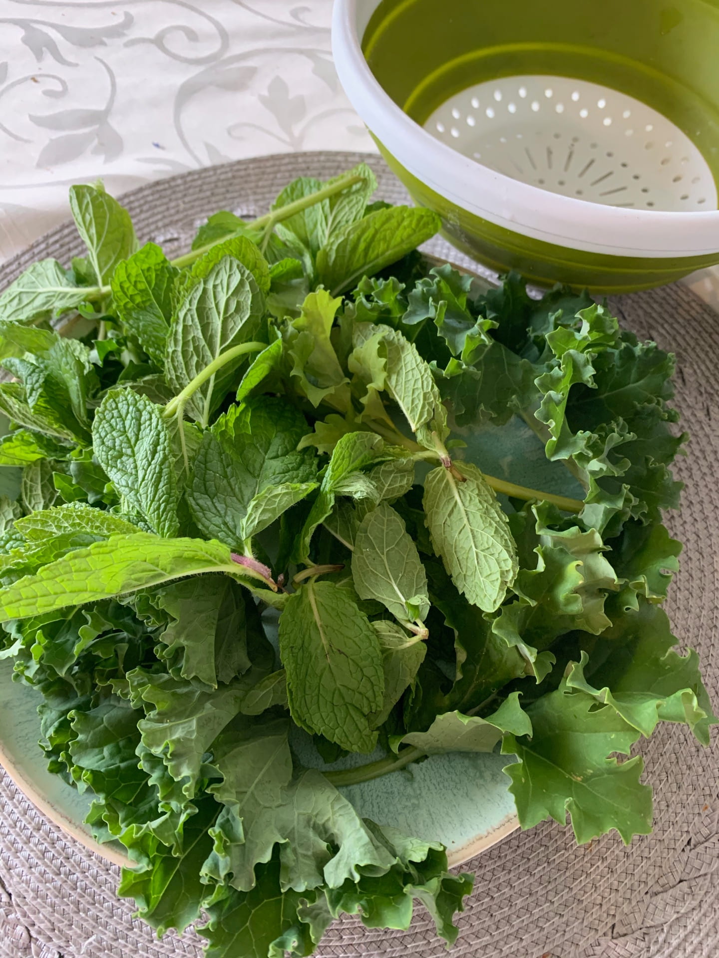
The last picture I took was a fresh mint, and kale picked from my backyard’s garden. With this photo, I tried to capture the greens’ simplicity without making it look too dull. This is why I included the strainer in the background that was used to wash the greens a few moments before. I like how the strainer is also green, so it doesn’t take the attention away from the mint and kale upfront but offers a sort of accent in the back. I made sure to use bright natural lighting to show how nature likes to make her greenery appear.