𝘗𝘳𝘰𝘱 𝘗𝘩𝘰𝘵𝘰
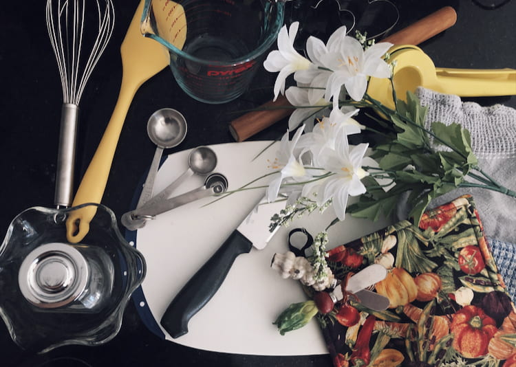
For the colour, I used a lot of bright colours since they stood out over the black counter top. The yellow and white complimented each other really well. I took the photo from the top so the camera could capture all the prop items. I like how all the colours work well with each other and the lighting makes the photo look happy.
𝘍𝘰𝘰𝘥 𝘱𝘪𝘤𝘵𝘶𝘳𝘦 #1
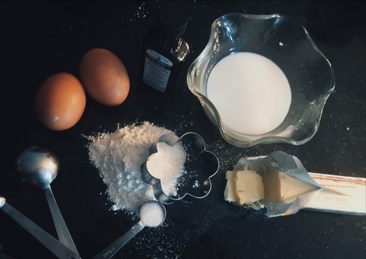
I tried to make this photo represent baking and how messy it can be. I mainly used colours such as white and silver. The egg and butter give the photo a splash of colour too. The lighting is darker so the other elements can stand out. I like how the photo is taken at a slight angle, and the way it’s edited.
𝘍𝘰𝘰𝘥 𝘱𝘪𝘤𝘵𝘶𝘳𝘦 #2

I tried to make this picture represent the many colours in cooking. I used colours such as red, yellow, and orange. The green from the bell pepper stems and the flower bring the whole photo together. This photo was heavily angled and composes of many different textures (ex. the peppers on top of each other). The white chopping board also gives the eyes a break from all the colour. Something I like here is the brightness of the photo.
𝘍𝘰𝘰𝘥 𝘱𝘪𝘤𝘵𝘶𝘳𝘦 #3

This last photo represents the flavour in cooking (with all the spices and the lemon). I scattered some spice onto the counter to give a bit of messiness and personality. All the colours are pretty neutral, so the blue checkered dish towel gives the photo a bit of contrast. The photo was taken slightly angled and I lifted the lid on the middle spice for extra texture. I like how everything comes together in a neutral way.