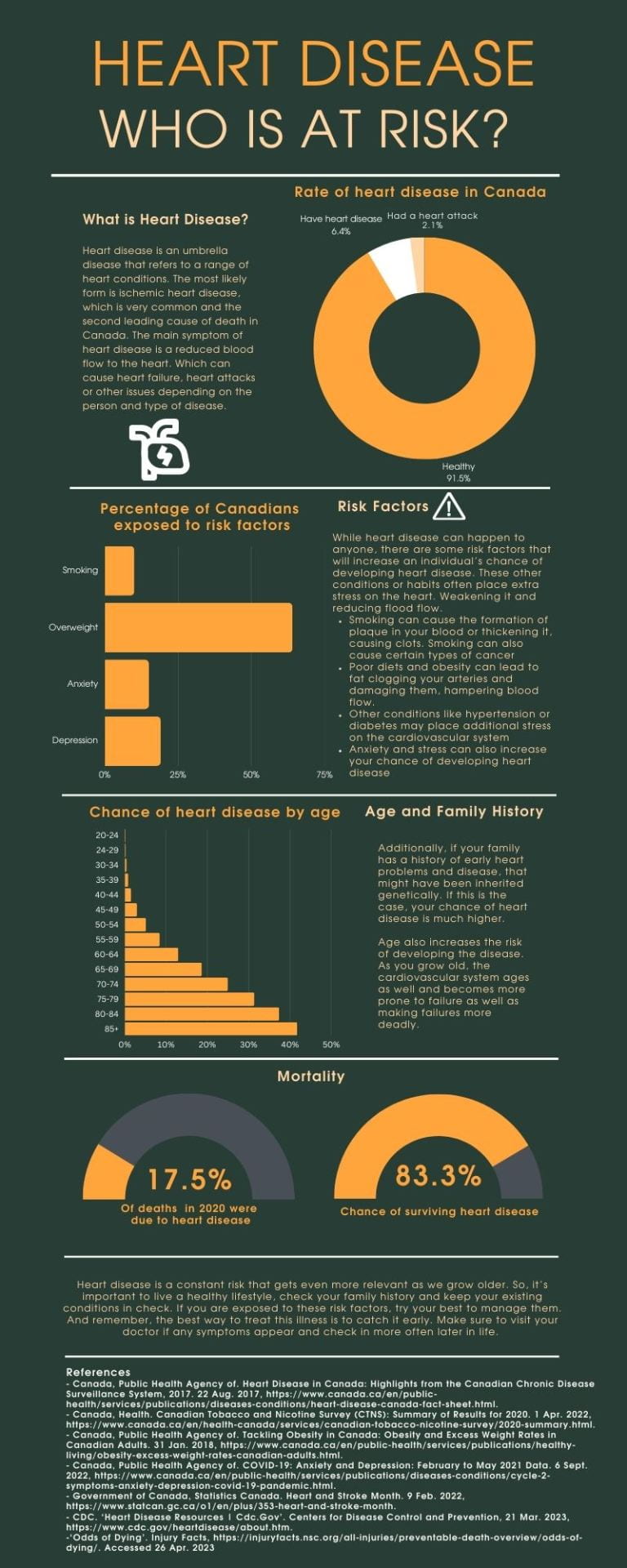
Heart Disease- Who is at Risk?
Reflection:
a) What is the overall topic and goal of the project?
I wanted my infographic to resemble a warning to encourage people to pay attention to their health. I wanted to chose a relevant disease and warn the reader about it. I chose heart disease as it is the second leading cause of death in Canada. To warn to reader, I highlighted the risks(percentage of deaths and people with the disease) of the disease and what factors play into it’s development and how many people are exposed to these factors.
b)What tool did you use and what did you learn about it?
I decided to use Canva to design my infographic. I was very surprised at how simple and easy the tool was to use. But, I also felt there was a lot a room for more advanced creation. I was also liked how versatile Canva was. You can do a ton of things like making videos, power point presentations or infographics. There are so many things you can do with the tool and it looks good even if you’re a beginner
c)How has the process of utilizing this tool impacted your understanding of how technology can change (or help) the world?
The tool hasn’t revolutionized my understanding of technology and helping the world. But I think resources like this are very helpful with spreading information when shared. It helps people who want to spread a helpful message even if they don’t have experience in design. They can make a professional looking and attention grabbing project to spread their message or important information.